WTSFest Philly is back on October 1st!
WTSFest Philly is back on October 1st!

Author: Jamie D'Alessandro
Last updated: 10/01/2024
Product pages on e-commerce websites are clearly valuable, but when did you last think about them beyond traffic metrics and sales? I believe there’s more utility to product pages than we give them credit for.
In this article, I’m going to dive deep into the importance of product pages: I’ll look at the current search landscape, talk a little about how Google Merchant Center fits in; plus I’ll share some great (and not so great) examples of product pages in the wild.
You’ll walk away with a better understanding of how product pages feed into your buyers’ journeys (before they even visit your website!).
As an SEO who works on a variety of e-commerce sites, I used to find that the framework I had for myself when it came to auditing a site was Collections/Category pages (or PLPs) first, and then product description pages (PDPs) second. I followed this approach because a site’s category pages are the pages that are going to rank for high-volume, priority keywords. They have a greater selection of products and are a crucial traffic source.
While I still allocate a lot of auditing resources on PLPs, I realize now that product pages need the same priority and attention, if not more.
There are a few key reasons for this:
Finally, the increased demand for online shopping makes prioritizing your product pages a no-brainer.
Google is an increasingly competitive space for e-commerce. Product pages are more important than ever with things like SGE, Shopping Listings, and even the recent rollout of Shop Deals.
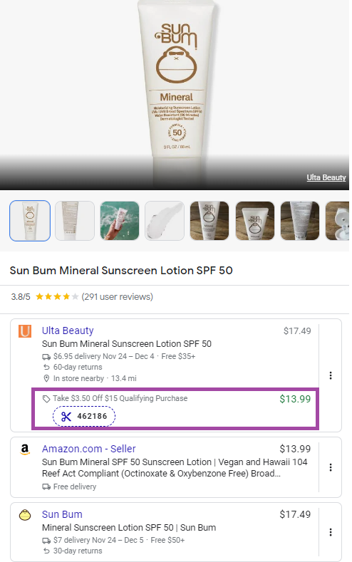
Take a look at a simple search for mascara. Let’s say I’m looking for a volumizing mascara in black. While regular “blue links” do appear, Google treats their search results as a mini PLP, allowing users to filter down without engaging directly with a website:
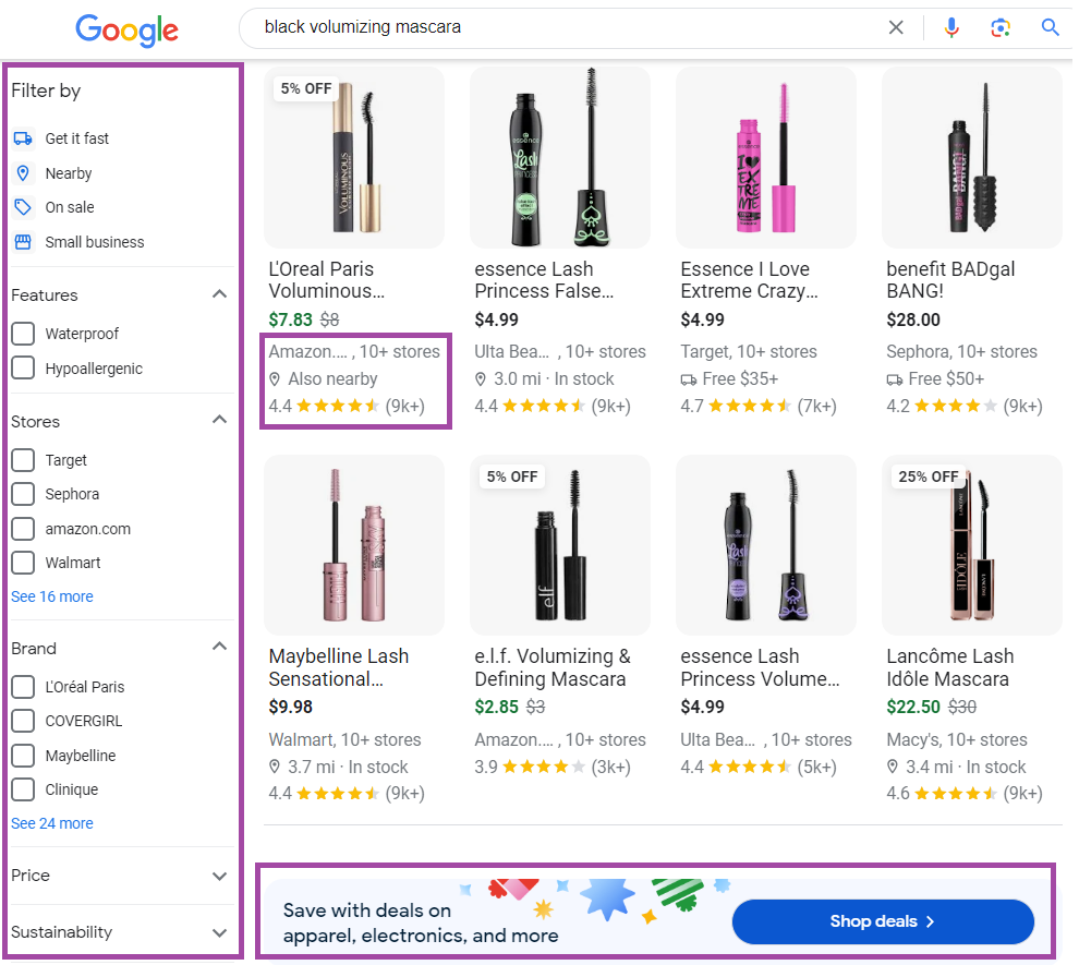
In addition to this, there are search “pills” that appear at the top of the SERP which give me further options for refinement:

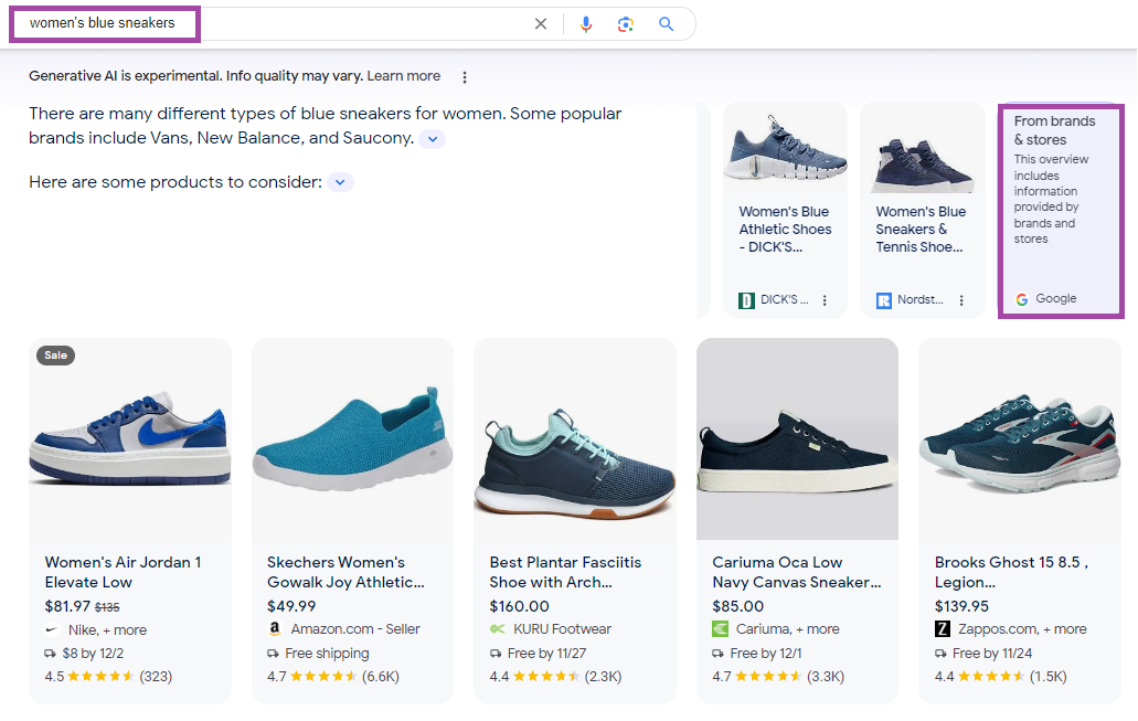
Even SGE is getting in on the action, leveraging the same data as the other shopping features to provide a result:
These options offer retailers multiple opportunities to appear, so it’s essential to ensure your on-site experience for products is meeting best practices. In addition to your product structured data, there’s another source you’ll want to take full advantage of because Google is, too.
As a refresher, Merchant Center is a free tool offered by Google that rolled out in 2010. It plays a critical role in the product listings we see on Google (such as product knowledge panels) and for many Google Shopping ads a retailer may run.
Google uses a combination of the structured data from your product landing pages and your Merchant Center in a variety of search “experiences”:
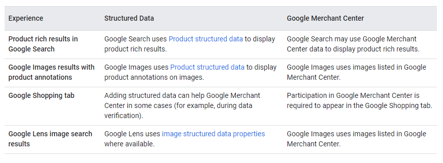
Source: Google Search Central documentation, “Share your product data with Google”
Information for products is uploaded via a feed. The feed can be as simple as an Excel document if you need to get started quickly, or you can implement more automated options.
Populating a site’s Merchant Center provides a wealth of information for Google to use in the SERPs, so you must be nurturing your feed just as much as you would your website.
Here are some things to consider when optimizing your Merchant Center feed:
There are plenty of other things to consider when optimizing your feed for the Merchant Center. Check out: Why You Should be Paying Attention to Your Google Shopping Feed by Mary Albright on the WTS Knowledge Hub.
While ensuring your Merchant Center contains all possible product information, the real gems are your landing pages. In our work as SEOs, we often overlap with UX (user experience) and CRO (conversion rate optimization). Essentially, our SEO work helps get people to the page, but everything else that needs to happen during that visit gets someone to convert. Let’s break down common landing page best practices and where they overlap with SEO:
Ensure that your page title and H1 accurately reflect the page's intent. Your body copy should detail all important elements of your product. The copy should highlight unique features and emphasize why this is the product to buy.
SEO: Optimizing page titles with target keywords and clear intent means it is easier for Google to understand your page, how to rank it, and where. The more precise the intent, the easier it is for customers to find you. Additionally, having high-quality, helpful product information on the page contributes to your overall E-E-A-T, which we know is crucial for Google.
UX: First impressions matter, especially when you're a new customer. How detailed a brand is when it comes to its product can help build confidence in the customer. The customer can find what they're looking for (and then some).
Structured product data is another way to help Google to understand your product. Structured data makes it easy for Google to “speak the same language.” When Google can understand something clearly, it makes it easier to use that information - and rank your PDP - where it needs to be.
I don’t think anyone outside of SEO cares about structured data. But this structured data can be the very thing that helps encourage CTR, so technically, it’s good for your users during their search on Google.
Shipping and return information is vital information for your e-commerce store. Whenever I shop with a new clothing brand, I ALWAYS check the return policy. I never know how something will fit, and so the return policy will often determine whether or not I make a purchase.
SEO: Your shipping and return information adds to the credibility of your brand, which again helps with E-E-A-T, specifically helping with trust signals. The more confidence Google has in your brand, the higher likelihood you’ll perform accordingly.
UX & CRO: A return policy allows customers to “de-risk” their purchase. This information should be available on the product page.
Online shopping may never replace the feeling of checking out a product in person, but boy does it try. Your product images are critical. They should be bright, clear, and showcase detail. For apparel brands, it should show all angles of a fit (and showing how an item looks on different body types is a definite bonus).
SEO: If you couldn’t tell the theme here, E-E-A-T is just as crucial for e-commerce as any other YMYL site. A variety of high-quality photos help build confidence and help set the standard of what great PDPs should include.
UX & CRO: A stock photo has never sold me, try to include a variety of product-focused photos and lifestyle images.
Over 58% of traffic comes from mobile devices, meaning traffic, and purchases, are happening on mobile. If your mobile shopping experience is lacking, you’ll likely miss out on sales. Even if you have an ideal mobile shopping experience, how fast your site is still matters.
SEO: Mobile-first indexing is here. Mobile/desktop parity is something SEOs need to be aware of, especially if their site needs to be more responsive or is intentionally omitting information on one version or another. It’s the mobile version of your site - and all of its data - that Google will use for indexing. Once you have your mobile site figured out, ensure it’s loading quickly. Page speed is one of many ranking factors that has everything to do with the experience your site offers. The slower the site, the worse experience your customer will have.
UX & CRO: Mobile sites that are functional and easy for customers to use are the difference between a customer bouncing or not. I’ve been on plenty of product pages where links are broken, information is missing, or worse, I can’t even add a product to my shopping cart. The better your customer experience, the higher the likelihood they will stay a while and hopefully make a purchase.
Internal links are such a powerful source of information. They tell search engines what pages we care about and which to crawl next. They help customers find related products or information they care about. They’re a win-win all around.
SEO: We can control (or influence) internal links, helping to make sure the most essential pages get linked to. We know the signals from internal links are strong and can help boost page performance.
UX & CRO: As a customer, internal links can direct you to new products you might have yet to learn about. My favorite things to explore on new sites are “Best Sellers” or “Customers Also Liked.” These pages allow customers to explore your site and your products without bouncing immediately if they don’t like the initial product they landed on. Giving customers options helps them feel in control of their purchase.
Generally, the optimizations you perform on your existing pages will apply to new ones. But newly added product pages often need a little more TLC. Here’s a checklist I follow when new PDPs are added:
What is considered “best” will always be subjective, but with millions of e-commerce websites, you become aware of which brands do things right (and which don’t). If you’re a visual learner like me, here are some examples of brands who I think are getting it right (and some who could do better).
https://www.apple.com/iphone-15/
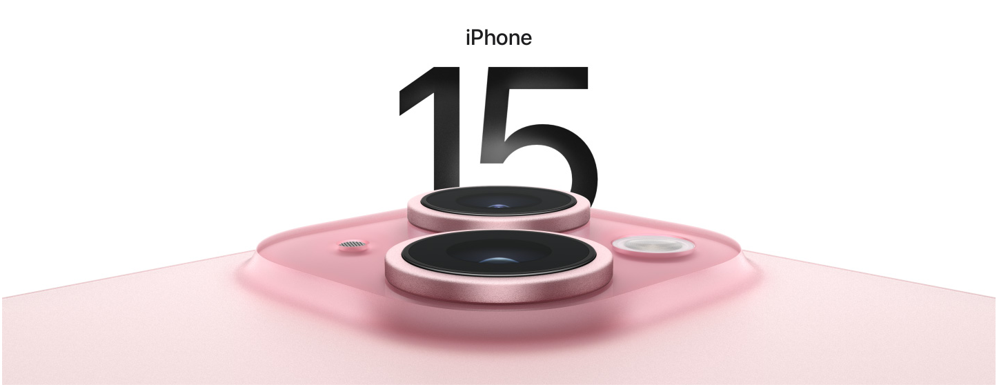
Have you ever thoroughly looked at Apple’s product pages for the iPhone? They’re as detailed as they come, with impeccable product imagery, opportunities to engage on the page, and loads of information on all the new features you’d care about.
https://www.marcellanyc.com/products/manhattan-one-shoulder-top-1
Marcella is a women's clothing brand I recently found and have been obsessed with ever since. Their product pages are pretty simple, but the information they provide gives me everything I need to feel confident about making a purchase.
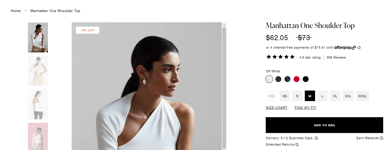
They offer tons of product images -- there are multiple angles, lifestyle photos, and even a GIF of someone putting on the shirt (they also have a video tutorial if you need it). Their value proposition is clear, and their brand ethos is right on display. But most importantly, their shipping and return policies are readily available. Marcella has also done a great job soliciting reviews, which are often the final consideration I need to make a purchase. Sometimes, it’s not about the fanciest web design. It’s about executing the basics beautifully.
https://code-wallets.com/products/stealth-wallet-titanium
A co-worker shared this brand with me since I’m in the market to buy my husband a new wallet. What I like here is that the product page clearly breaks down the unique features of this wallet.
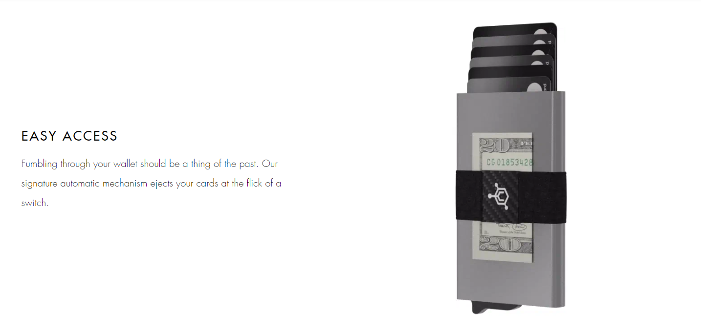
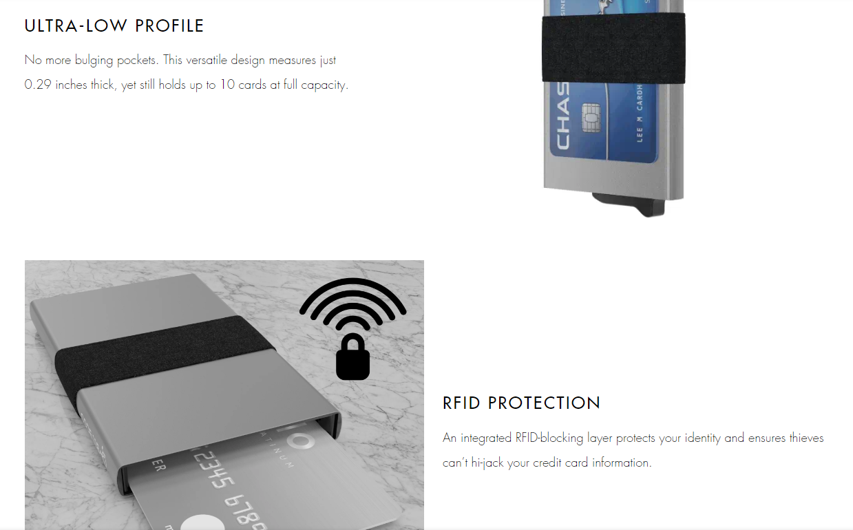
The visuals of the wallet show how you can hold up to 10 cards and how easy it is to access them. They speak to their audience with phrases like, “No more bulging pockets,” which is the exact thing my husband looks for in a wallet. The value propositions of the wallet are clear and straight to the point. Even their warranty is clearly stated on the page, which we know can help with conversions.
https://www.kumacoffee.com/collections/frontpage/products/bear-claus-holiday-blend
We know what a great PDP looks like, but what about PDPs that need more TLC?
We love coffee on our team and another co-worker spoke highly about this brand. While I have no doubt the coffee tastes great, their product page is lacking:
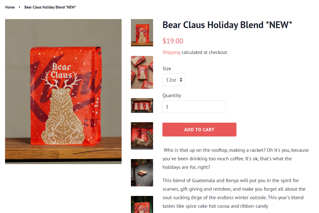
First, the breadcrumbs don’t give me the option to go back to the collections page the product is a part of. That’s an immediate fix. Second, the page design doesn’t feel the most user-friendly, especially with the photos on the right-hand side and creating additional white space. These images are even more of a problem on mobile, pushing the CTA way below the initial view.
But most importantly, where is the return information? What are their shop policies? Can I get free shipping over a certain dollar amount? Where is the option to leave reviews? Plenty of opportunities for this page.
https://londonfog.com/products/plus-size-zip-front-long-length-puffer-jacket-with-zip-off-fur-trim-hood-l463714c
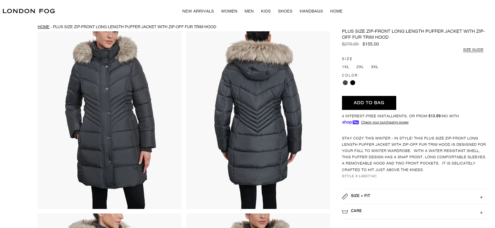
London Fog is another example of a quality product but not-so-quality product page. London Fog has the same breadcrumb issues that don't include the product's parent category. The page design is all black and white, with little to no visual elements to break up the text. This jacket is on sale, but look how underwhelming it is! Why not highlight this discount? Show a percentage off?
There's no additional imagery that shows off other angles or lifestyle photos. Again, there are no reviews, so potential consumers can’t gauge how other customers felt about this coat or how it fits. Return information is available, but it’s at the bottom of the page.
There are often so many opportunities to improve product pages that it can feel overwhelming. If you’re not sure where or how to get started, here’s how I’d suggest prioritizing:
Remember, creating the best product pages is a marathon, not a sprint. Leverage your customer behavior data to see how you can make improvements.
I hope I’ve done a convincing job of showing you that product pages are deserving of a little more love and attention. They are the last stop between your customer and a sale, Google leverages them in any way they can in the SERPs, but most importantly, they are a way to connect with your customers. They’re such a vital touch point for your brand. When you invest in your customer’s experience from the beginning, your brand can only go up.
We pay our authors, speakers & team to bring you helpful content like this.
We aim to always keep our content and community free and accessible.
If you've found value in WTS, please consider supporting us through our Buy Me a Coffee initiative.

