🌲 WTSFest Portland - May 7th 2026 | 🥨 WTSFest Philadelphia - October 1st 2026
🌲 WTSFest Portland - May 7th 2026 | 🥨 WTSFest Philadelphia - October 1st 2026

Author: Tina Reis
Last updated: 16/03/2026
You’ve created a solid, data-backed SEO strategy and are excited about the growth it’s going to unlock. But you’re not deciding alone – you need budget, development resources, or collaboration between different teams. This is where many SEO initiatives get stuck: their success depends on implementation, and this usually means getting buy-in from an executive (if you’re working client-side) or a client (if you’re agency-side).
In my experience, when SEO initiatives fail to achieve this buy-in, it’s typically because:
The second part, the emotional side of buy-in, is often neglected because we focus on convincing our stakeholders intellectually. But in reality, we need both intellectual and emotional buy-in. You want your stakeholder to understand, agree, and be excited about getting started.
Data Storytelling is a tool that has helped me tremendously in achieving buy-in, and getting SEO initiatives implemented.
Data covers the intellectual side of buy-in. It appears neutral and lends credibility, as it is hard to argue with hard facts from trustworthy sources. And what’s even better is that data shifts the conversion from what to why. We are no longer arguing about what to do, we are focusing on the outcome.
Storytelling addresses the emotional side of buy-in because it structures your argument in three parts: A state of balance at the beginning, a messy middle where you are confronted with a problem, and the resolution, with your stakeholder positioned as the hero of the story.
In this article, I will walk you through the fundamental processes of data storytelling as it relates to SEO buy-in step by step.
In order to use data to achieve buy-in, you need to have data for your proposal in the first place. When you focus on data, you’ll see that it serves as a filter for which initiatives to bring to your stakeholder. Early in my career, a lot of the initiatives I pursued were based on best practices. As I learned about SEO, I built a picture of the ideal, SEO-optimized website in my head. Then whenever I worked on a new project, I would try to get that website as close to this idealized picture as possible.
As time went on, I increasingly saw the downsides of this approach. First off, following best practices doesn’t always deliver results – in one client project, I fought hard to have a best practice implemented, only to find that it didn’t have any impact on performance whatsoever.
The second hurdle is in communication: when your only reasoning for a proposal is that it is best practice, you are presenting your stakeholder with a lot of shoulds without a solid foundation. And it’s not motivating either.
A third reason why a best-practice-focused approach doesn’t work is that search is changing and diversifying. As AI search has moved our focus from Google to a variety of additional channels, there are fewer and fewer best practices that universally apply to every website, because it all depends on the preferred channels and modes of searching of your particular target audience. Now, more than ever before, what success looks like and how to achieve it, has to be defined for every brand and every website individually.
Data helps you filter your ideas and focus on those that will really make an impact in this new ecosystem of search.
In SEO, we typically work with metrics such as clicks, impressions, click-through-rate, visibility share, number of citations, and the like. But your stakeholder might not care about these metrics at all. If they understand SEO, they might know how your metrics relate to theirs, but don’t expect them to do this mental calculation on their own when you’re presenting to them. Speak in their metrics to begin with.
This is especially important when you’re talking to a CMO or CFO for budget approval. Nancy Duarte lays out in her book “Data Story” how the metrics executives care about typically fall into one of three categories:
There are many ways to tie your SEO metrics to one of these categories. Here are some examples:
Everything you propose costs someone something. If it’s not budget, it is time (and that is part of the budget as well). When you propose your initiative, your stakeholder will weigh the expected results against the cost. You influence that this calculation turns out in your favour by anticipating the cost question and including a return-on-investment (ROI) calculation in your proposal.
Showing that you’re thinking about ROI and cost also builds trust with your stakeholder.
Now that you know which data to present and what the estimated ROI of the proposal is, make sure you formulate your ask as concisely as possible. This includes:
Storytelling is how you’ll add an emotional element to your intellectual argument.
A story has a beginning, middle, and end. The beginning is usually a state of balance – everything’s fine. Then something happens that disturbs that balance – the messy middle. The end represents the resolution: by solving the challenge, you restore balance.
Here’s an example:
Our organic traffic was predictable and growing steadily (balance).
Then Google introduced AI Overviews in our country and zero-click searches increased (the disrupting force). We investigated our priority keywords that now triggered AI Overviews and saw that our competitors were featured more prominently in mentions and citations (our challenge).
We decided to increase our visibility share by implementing measures A, B, and C (our solution).
After 3 months, our visibility share increased by 20% (balance is restored).
People have a tendency to want to make themselves the hero of the story, especially in a professional context where you are constantly trying to prove yourself. But when it comes to buy-in for a proposal, it is more effective to make your stakeholder the hero. Their decisions are influencing the outcome. Positioning them as the hero in the story acts as an emotional hook.
This can be as simple as changing an “I” to a “you”: Instead of “I can use this budget to increase sales from organic search”, you can say “By allocating this budget, you can increase sales from organic search”. It’s a small change with a big impact.
You have your data, you know the story you want to tell – now it’s time to visualize your data so it can have the most impact.
A great resource on data visualization is Cole Nussbaumer Knaflic’s book “Storytelling with Data”. I learned most of the techniques I’m going to present in this article from her.
Two guiding principles lie beneath the techniques I learned:
Now let’s see how you can implement these two insights in practice.
One common mistake when visualizing data is to show everything you’ve analyzed. Maybe your goal is to show just how thorough your analysis was. But the truth is that executives don’t care about the process, only the outcome. Taking them on a journey through all of your data wastes precious time and can in the worst case just confuse your audience. Instead, focus only on the end result: the key pieces of data that support your story. Nothing more.
When it comes to the type of chart you use, pick charts that the audience is already familiar with. This is not the place for innovation – for SEO presentations, I seldom use anything other than a simple line or bar chart.
That said, there are, however, some types of charts that we are familiar with because they are commonly used, but in fact, they are not very easy to understand and should be avoided.
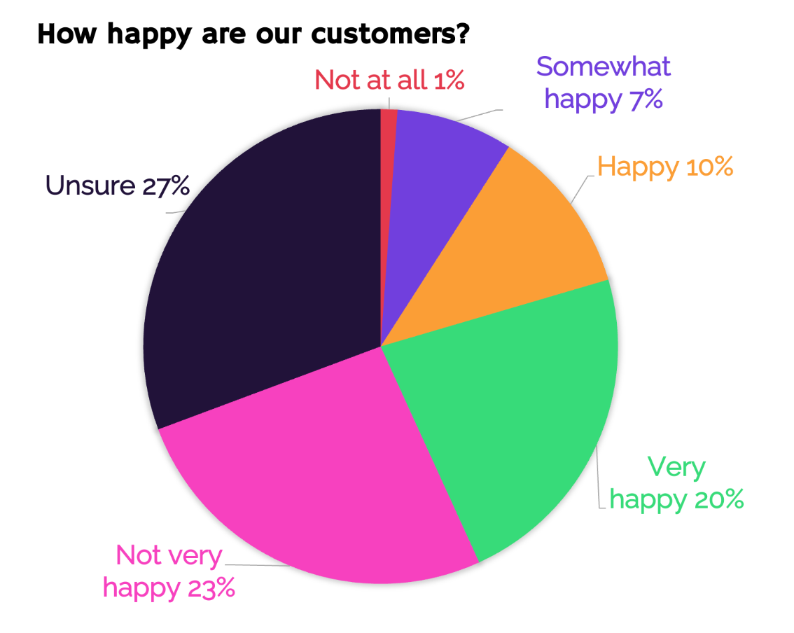
A pie chart with the title “How happy are our customers?”. Clockwise: Not at all 1%, somewhat happy 7%, happy 10%, very happy 20%, not very happy 23%, unsure 27%.
If you look at this pie chart, can you tell at a glance how happy the majority of customers are? What’s the key message that the creator of this chart is trying to communicate?
Pie charts are notoriously hard to read, especially if your data is more complex. Don’t make your audience do calculations in their head, and avoid this type of chart.
This is a better way to present the same data, because the horizontal bars make it easier to see the size differences between the categories:
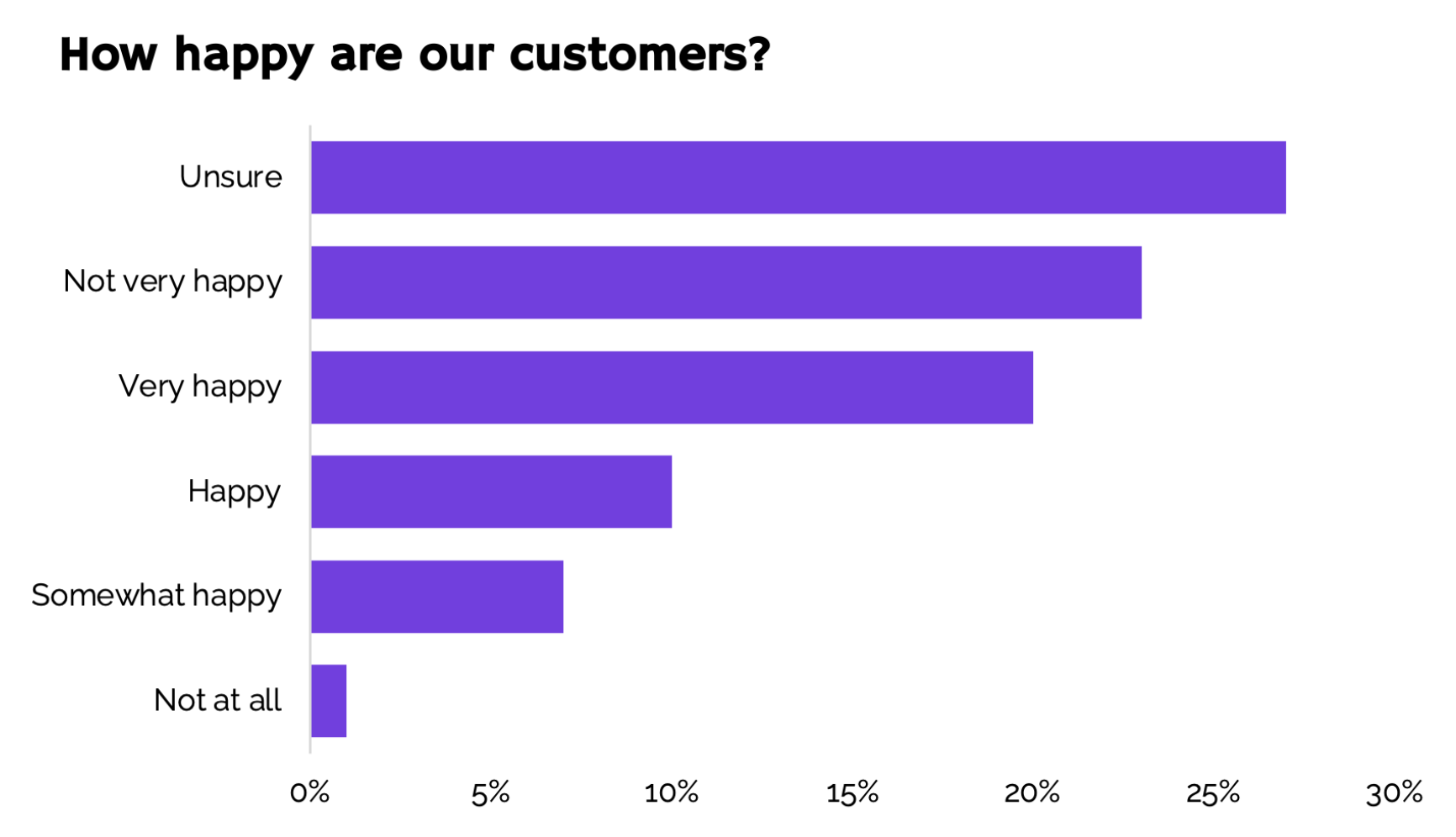
A bar chart with the title “How happy are our customers?”. From top to bottom: Unsure 27%, not very happy 23%, very happy 20%, happy 10%, somewhat happy 7%, not at all 1%.
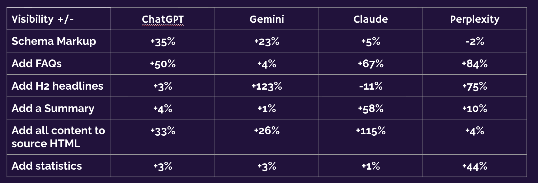
A table depicting visibility across various AI surfaces.
Tables are great because they allow different people to look up whatever they are most interested in. The problem is, when you’re presenting a slide deck, you don’t want your audience to do that. You want them to focus on the story you want to tell. (That said, tables are great to include in the appendix to a presentation, though.)
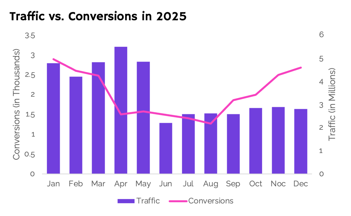
A graph showing traffic on the primary axis, and conversions on the secondary axis
A secondary axis seems like a good idea if you want to show how two metrics correlate over time, but the two axes add more work for your audience. Their eyes wander from axis to axis to make out the scale.
A better way of achieving the same result is to get rid of the secondary axis and show the values directly above the data:
Note that I also placed the axis descriptions right next to the data, to make it even easier to understand.
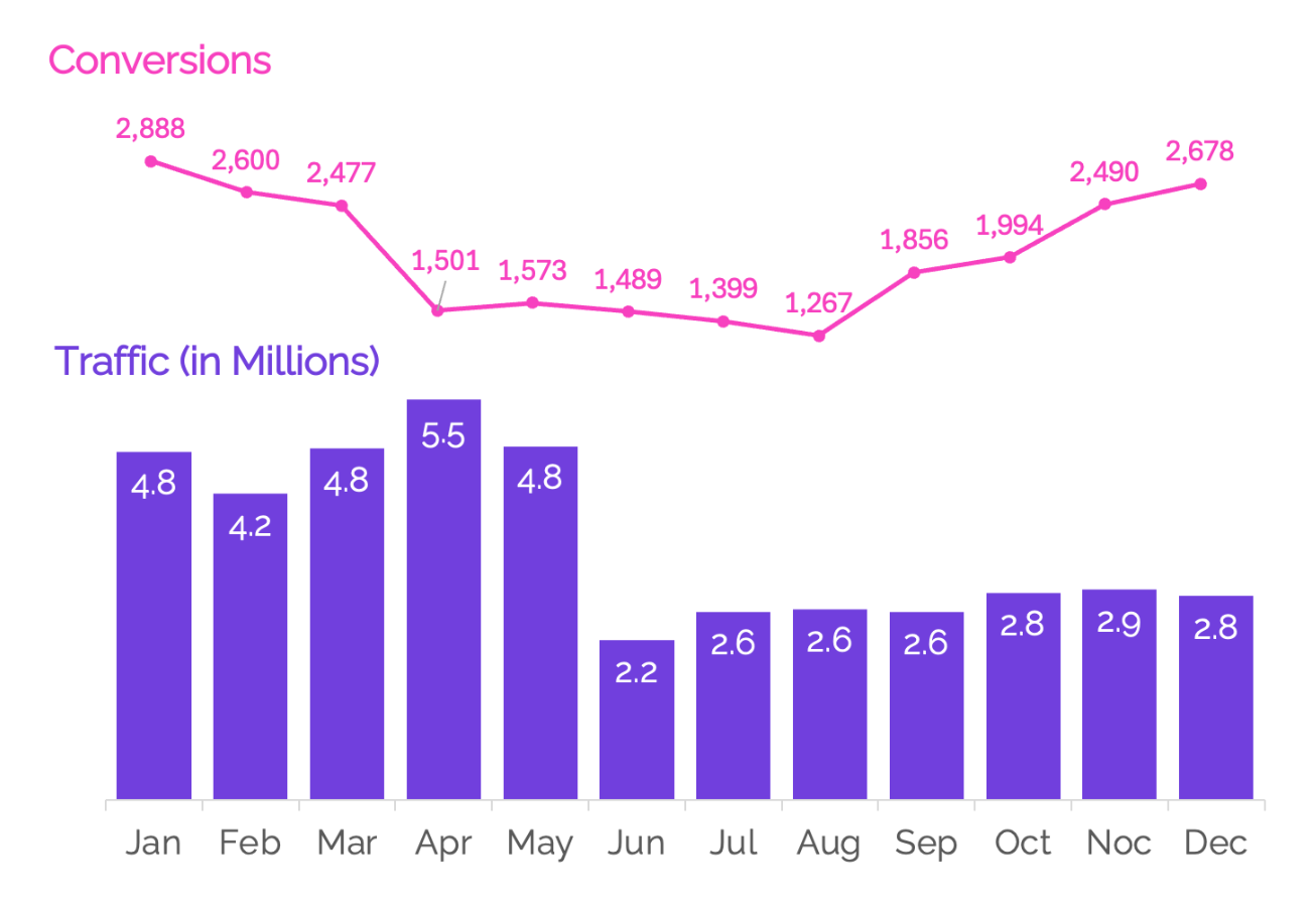
A visual showing two graphs, the first shows conversions, and the second shows traffic.
Clutter adds cognitive load, and unfortunately the default charts you find in Excel and Google Sheets add a lot of unnecessary elements. That’s why, as soon as you’ve settled on the type of chart, the next step is to remove everything. Even the colors, because colors are best used strategically, not as decoration:
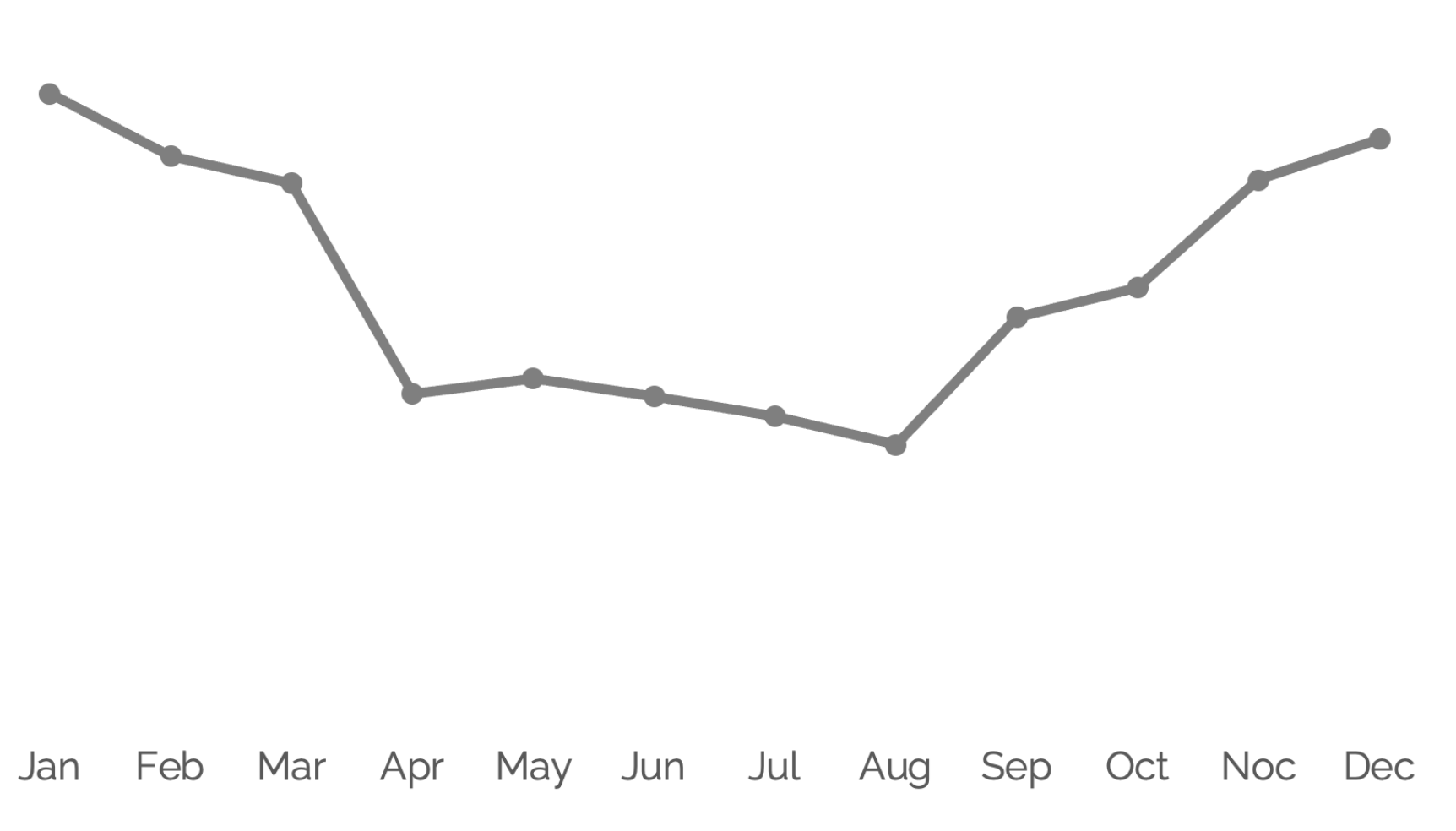
A simple line graph with all visual elements removed.
Ask yourself: What do I want to say with this chart? Your message should be clear from the presentation. In this example, we want to convey that conversions dropped after an algorithm update and returned to normal levels after fixing issues over the summer.
The parts of the chart that correspond to this story are the drop in the beginning and the recovery at the end. I can use color to highlight them and draw the eyes of the audience:
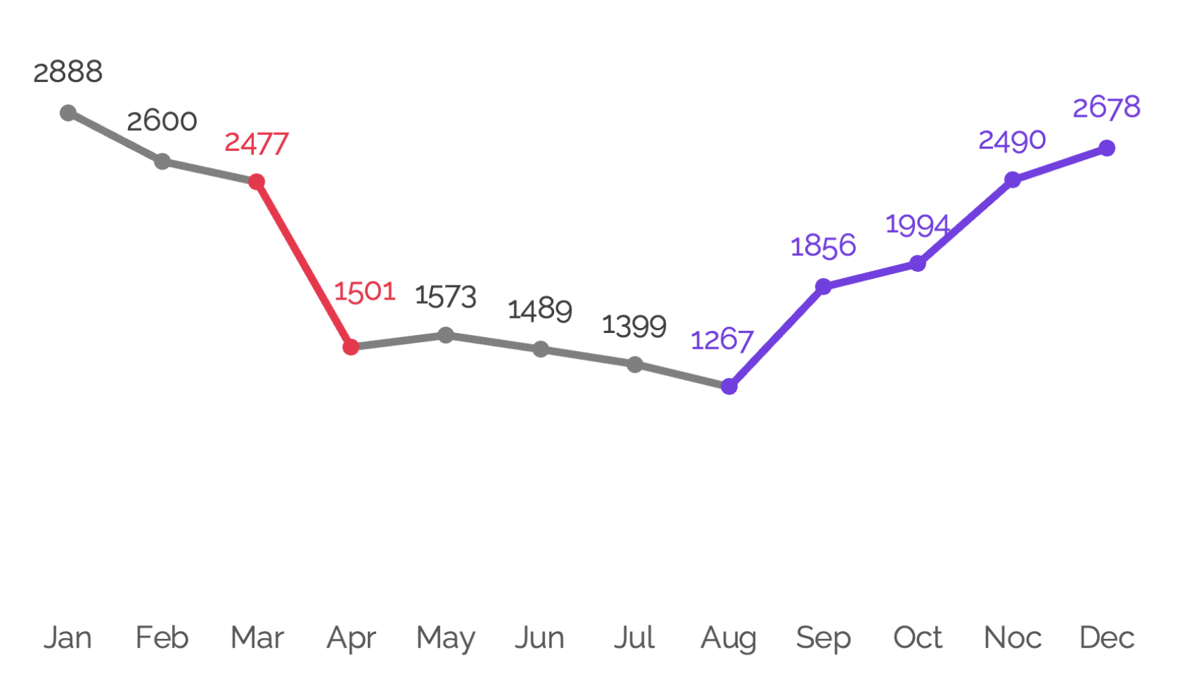
A line graph which uses color to tell the story. In months where conversions dropped the line and data labels are red, then in the months when conversions recovered the line and data labels are purple.
Data visualization is not only about the visuals – it’s also about the words that you add to your visuals to make your conclusions crystal-clear and memorable. See how the chart is immediately easier to understand now I’ve added in the commentary?
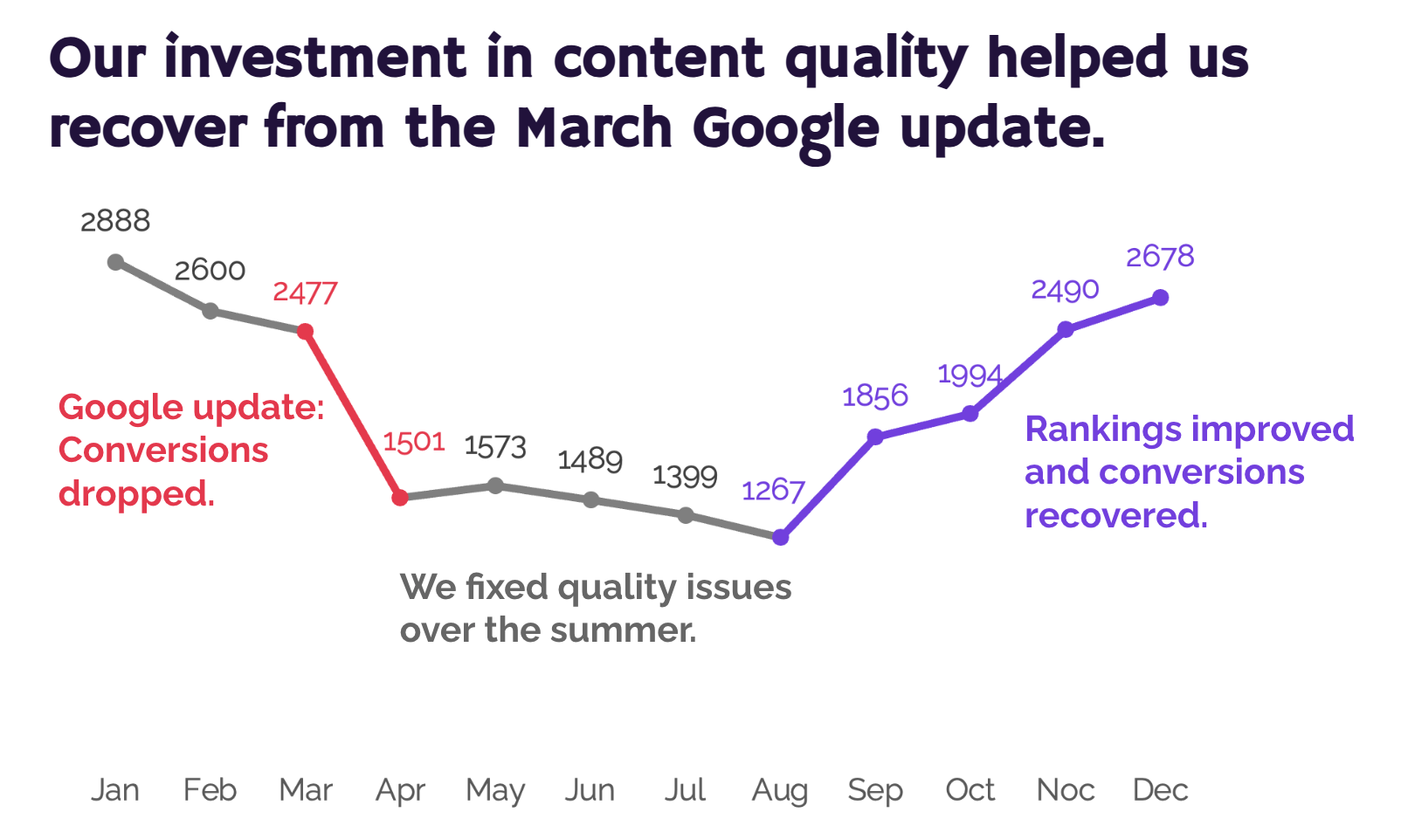
A line graph which uses color and annotations to tell the story. The chart is titled: “Our investment in content quality helped us recover from the March Google Update”. In months where conversions dropped the line and data labels are red and the annotation reads: “Google update: Conversions dropped”. In the months where conversions remained reasonably steady, the line and data labels are grey, and the annotation reads: “We fixed quality issues over the summer”. In the months when conversions recovered the line and data labels are purple, and the annotation reads: “Rankings improved and conversions recovered”..
A chart like this sets the stage perfectly for the next step, the ask: Please approve the budget so we can keep investing in quality like this and protect ourselves from future algorithm updates.
Getting buy-in for your SEO initiatives isn’t easy – but data storytelling is a valuable tool that can set you up for success in the best possible way.
You can access all 10 recordings of the wonderful talks at WTSFest London 2026, for just £149!


Tina Reis - Senior SEO Consultant, NP Digital
Tina Reis is a Senior SEO Strategist with over 10 years of experience in search, specialising in data-driven strategies that support sustainable organic growth. They approaches client relationships as strategic partnerships, working closely with organisations to understand their broader business goals and values beyond organic search.
Tina has worked with international brands including Stripe and Adobe, helping them expand their presence in the German market through international SEO and localised content strategies. They have also won a US Search Award with the Menerva Digital team for their work on Proofpoint.