🌲 WTSFest Portland - May 7th 2026 | 🥨 WTSFest Philadelphia - October 1st 2026
🌲 WTSFest Portland - May 7th 2026 | 🥨 WTSFest Philadelphia - October 1st 2026

Author: Franzi Dietrich
Last updated: 27/05/2025
Accessible content increases your chances of reaching more people and ensures that you exclude no one. At the same time, focusing on accessibility also improves your SEO performance. In this guide, I'll show you how accessibility and SEO go hand in hand when creating your web content.
The World Health Organization reports that over 1.3 billion people worldwide, or 16% of the global population, live with a disability.
For individuals living with disabilities, issues with accessibility mean that many websites are frustrating, or even impossible to use.
The good news is that you can make a difference! The latest WebAIM Million Report shows that the biggest accessibility issues are related to site content. That's where you come in.
Here are some of the findings from the latest report:
To overcome these issues, it helps to know the WCAG guidelines.
The Web Content Accessibility Guidelines (WCAG) are your basic framework. The main principles are:
WCAG 2.2 has three levels - think of them as medals:
For most websites, level AA is the right way to go. This is also the level required by the European Accessibility Act from June 2025.
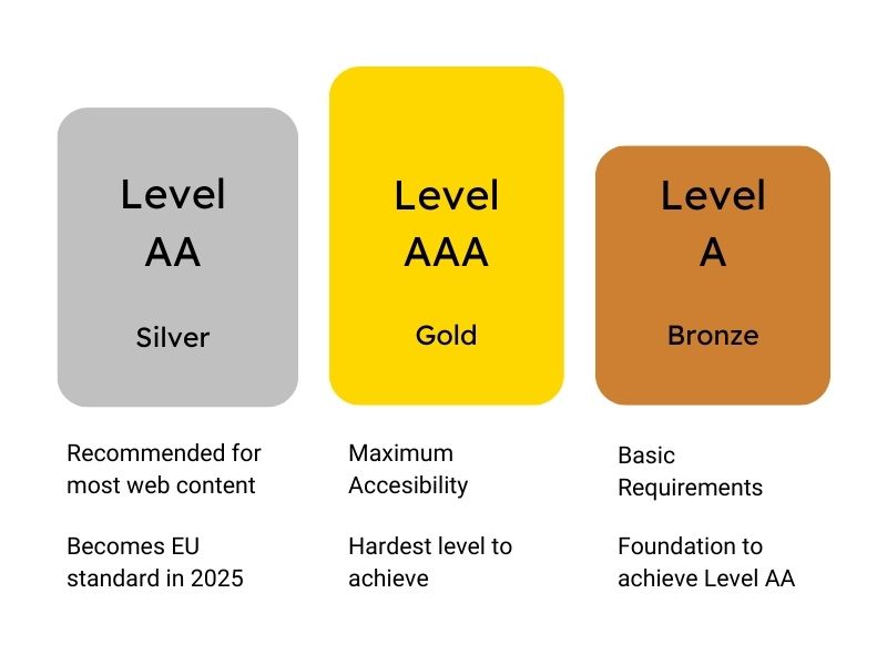
It is also worth noting that WCAG 2.2 was published in October 2023, with the most recent update in December 2024, and they have introduced new success criteria. So it's worth keeping up to date.
Don't worry: you don't need to know all the WCAG rules by heart to get started. Focus first on the basic idea that everyone should be able to use your content. For the technical details, use practical tools and checklists to start.
Let's start with an important element. Good typography makes the difference between skimming, and reading to the end. Here is what you should keep in mind:
The WCAG itself mentions font size in the context of contrast, which I’ll talk more about later. The guidelines also recommend the inclusion of 'scalable' text. This means that users should be able to increase the size of text by up to 200% using standard browser features, without losing any content or functionality. Since you may not be able to do this by yourself or right away, starting with a minimum font size is a good idea.
Variable fonts make your design more flexible and efficient. They have many benefits:
Besides typography, your content's structure is crucial. It matters for users, screen readers, and search engines. Having a clear structure makes navigation easier, and helps both users and screen readers understand your content.
Think of your headings as signposts:
These are the four golden rules for headings:
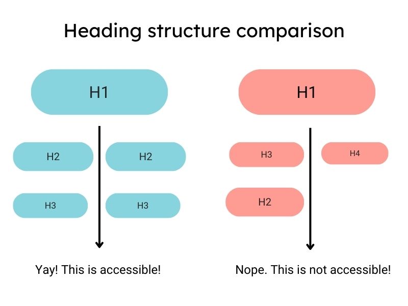
A clear structure with helpful headings will let readers find information quickly. This increases the chances of your most important messages getting through.
Since this structure is vital for screen readers, let's examine how they work.
Like you, screen readers follow a clear structure with meaningful headings. A logical hierarchy of headings can help blind and partially sighted people find the information they seek.
Accessibility and SEO go hand in hand. Well-structured content with relevant keywords in the headings improves both. They can also have a positive impact on your rankings. Besides headings, a few other easy fixes can help screen reader users.
The latest WebAIM Screen Reader User Survey identifies these key factors for an easy-to-use website:
These figures show that you can make a big difference with just a few targeted adjustments. Here are the points to keep in mind:
Test it yourself:
Pro tip: Test your site with different screen readers and browsers. Results may vary. This will help you make your content more accessible.
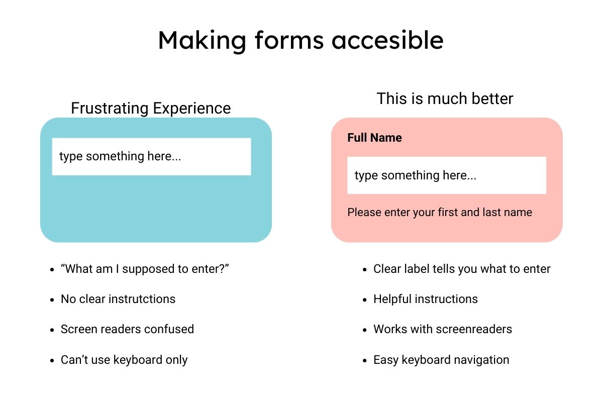
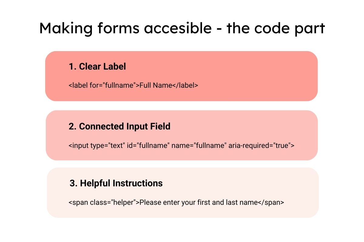
Another area where screen readers often struggle is forms. Let's take a look at how to make them more accessible.
The WebAIM Screen Reader Survey found that complex forms are a top issue for screen reader users. They are often the point at which users need to interact with your site - and sadly, the point at which many fail.
Imagine trying to fill out a form, but you don't know what goes where. Screen reader users feel similarly lost with poorly designed forms. Labels are the key here. They show which information needs to go in each input field.
If something goes wrong, show meaningful error messages. “Input invalid” is very frustrating if you can't see what the issue is.
In summary, the following considerations are important:
Clear labelling
Error handling
Good error handling helps users fix mistakes on forms with minimal effort. These are the key points to remember:
Grouping
Grouped related fields help users to understand the structure of a form. Some best practices are:
These practices are key to making accessible forms for all, which enhances both user experience and compliance with accessibility standards.
Test Tip:
Important: These adaptations help people with disabilities. They also improve usability for everyone who visits your site. If you can't adapt the forms yourself, ensure you communicate these needs to your dev team.
ARIA is a set of attributes you can add to HTML elements to improve the accessibility of your web content. This is particularly important for dynamic content and advanced user interfaces. ARIA helps bridge the gap between standard HTML and the needs of users with disabilities. ARIA tags provide context and information for assistive technologies such as screen readers.
For example, ARIA attributes can show an element's state. They can show whether a menu is expanded or collapsed. They also provide labels for elements that have no visible text. By using ARIA correctly, developers can enhance website accessibility. As a content creator, or SEO you may not be able to implement this directly, but, you can submit requests to your developers.
Forms are not the only interactive elements on your website. Well-designed links are also really important.
The WebAIM Million Report says 44.6% of links are inaccessible. This is mainly due to their lack of clear context. Not only does this frustrate screen reader users, it also hurts your SEO.
How to create links that help everyone:
Readability is the key to ensuring your content is accessible to everyone. An important tool is the Flesch Reading Score, or Flesch Kincaid Grad Level. The first rates the readability of your text content on a scale of 0 to 100. The second shows the equivalent US school reading grade.
Both scores help you assess whether your content is reaching your target audience.
Here are the main guidelines:
Here’s a specific example:
Nay:
❌ The systematic implementation of optimised content structures significantly maximises the user experience.
Score: 0 - Hardly anyone understands this!
Yay:
✅ Good, structured text makes readers happy. They find what they are looking for quickly.
Score: 73.3 - Perfect for the web!
Pro tip: Tools like Hemingway Editor will score your text. But remember: the score is a guideline, not a law. Sometimes you need technical terms or more complex sentences - just explain them directly.
These techniques will make your text easier to understand:
Remember that simple, clear language not only helps the average reader. It also makes your content more accessible to people with cognitive or learning disabilities. In this way, you can reach a wider audience and improve the accessibility of your website at the same time.
Good copy should sound natural, even when optimised for search. Unfortunately, a lot of keyword-optimised content sounds jerky and is difficult to read. This not only frustrates your readers, but also affects accessibility.
How to balance SEO considerations and readability:
A practical example:
Nay:
❌"Creating accessible websites for accessible websites that are accessible".
Yay:
✅”Design accessible websites that everyone can use, regardless of their needs”.
Pro tip: Read your text aloud. Are you stumbling over words? Your readers will do the same. Good writing sounds natural - to people and to search engines.
A balanced keyword strategy supports both your SEO and accessibility goals. Using varied and contextual terms helps both search engines and users.
Visual aspects are also important for accessibility, let’s talk about color and contrast…
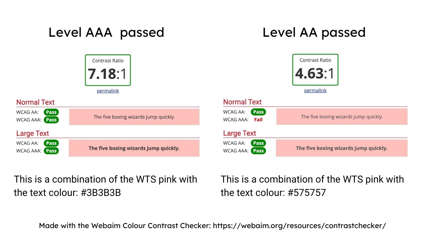
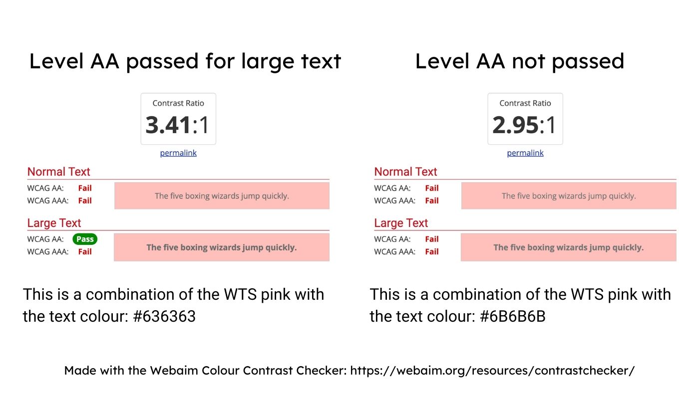
Colour and contrast are not just aesthetic choices. Around 8% of men and 0.5% of women have a form of colour blindness (Colour Blind Awareness Study). Also, people with visual impairments or poor quality screens can be impacted too.
Contrast ratios seem complicated, but in simple terms: the bigger the difference in contrast between the text and the background, the better. Think of white text on a light grey background - hard to read, isn't it? That's exactly what contrast ratios measure.
WCAG 2.1 gives clear guidelines for contrast ratios:
Level AA (the one we all should aim for)
Level AAA (the gold medal)
Instead of complicated calculations:
Never use colour alone to convey information. Instead:
Pro tip: Do the greyscale test - convert your text to black and white. If you can read it well, your contrasts are probably ok.
Visual and audiovisual content makes your work come alive. It helps people grasp complex topics. But not everyone can see images or hear videos. The latest WebAIM Million Report shows: there are an average of 55.6 images per homepage, 21.6% of which have no alt text. In the case of linked images, the alt text is missing on 1 in 4 images.
Alt text is your most important tool for accessible images. The study shows that 14.6% of existing alt texts are problematic because they only contain words like “image”, “graphic”, “blank”, file names, or duplicate text.
Alt text should provide a detailed description of what the image shows and its function. Remember: search engines and screen reader users ‘see’ your images through these descriptions.
How to make images accessible to everyone:
Pro tip for alt text:
✅ Good: “Barista pours milk foam into coffee cup, forming a heart pattern”
❌ Bad: “Picture of coffee” or “coffee-final-02.jpg”
For each image, ask yourself: What would I tell someone who can't see the image? The answer is your alt text
Images are the beginning - modern websites also thrive on audio and video content. The same applies here: content only fulfills its purpose if everyone can use it.
As multimedia content gains importance, accessibility remains crucial. The WebAIM study shows that many websites lack basic accessibility. If images are not accessible, this often applies to more complex media, too.
Videos and audio content like podcasts are great formats for explaining complex topics. But without the right additions, you're excluding a lot of people - and giving away SEO potential at the same time. A study by Moz shows that pages with transcripts have an average of 15% more organic traffic.
What you need for accessible video and audio content:
When choosing video and audio players, note the following:
The digital A11y project has an overview of accessible media players.
Pro tip: A good transcript is an opportunity! You can use it as a blog content, for social media, or as the basis for other content formats.
Multimedia content is only one piece of the puzzle. It's just as important that all visitors can navigate your website using a mouse, keyboard, or voice control.
Imagine entering a large building with no signposts - frustrating, isn't it? People feel the same way on poorly structured websites. Here's how to make navigation more accessible:
Clear structure:
Keyboard navigation
Mobile navigation
ARIA attributes for improved accessibility
Test tip:
Put your mouse away and navigate through your website using only the Tab key. Can you get anywhere? Can you always see where you are? Good navigation is like a reliable travel guide - it ensures that nobody gets lost.
But how can we ensure that all these measures really work? This is where regular testing comes into play.
A thorough content audit helps you to identify and remove barriers to accessibility. It's best to approach this in three steps:
Schedule for regular audits:
Don't forget: Document all improvements. This way you can see your progress and apply successful changes to other areas.
Investing in accessibility pays off in several ways. There are no direct ranking factors for accessibility. But, studies and experience shows it helps.
Indirect SEO benefits
Business benefits:
A practical example: A study by SEMRUSH and BuiltWith examined 847 accessibility-focused domains. The results: on average, these sites saw a 12% increase in total traffic. Even more, 73% of the domains saw a boost in organic traffic after they improved accessibility.
Economic significance: People with disabilities have a purchasing power of about $18 trillion USD worldwide. This underlines the enormous economic potential of accessible websites.
Remember the numbers from the beginning from the WebAIM Million Report? They showed us what people are struggling with on a daily basis on websites.
With everything you’ve learned, here is what you can do to help reduce these numbers:
81% of homepages have low contrast text
Do you like reading a light gray text on a white background? Me neither! And neither do your users! So here’s what you can do:
54.5% of images missing proper alt text
You’ve probably experienced this yourself at some point. The page is just not loading which means you can’t see the picture. And the alt text be like - nope, nothing there. Annoying isn’t it? Imagine experiencing this every day on almost every website. This is what you can do:
48.6% of forms lacking labels
We’ve all experienced bad forms online. The difference is that most people without disabilities can still complete them. However, that’s not true for everyone, so make sure that:
44.6% of links don't say where they go
As SEOs or content writers, you might know that “click here” isn’t helping search engine crawlers. But you might not realise how important link text is for accessibility. Here’s what to keep in mind:
To help you create accessible content, here are some tools:
Remember: You don’t need to fix everything all at once. And you don’t need to aim for the gold standard. Start with one small thing today and continue from there:
Today
This Week
This Month
Keep Learning
The internet and technology is evolving quickly, and so are accessibility standards. So try to stay up to date via:
Every small step you take helps. So start small - it’s about making the web a little bit better every day. To make it even easier to get started, I’ve created an Accessible Content Summary for you to download and save.

Franzi Dietrich - SEO & Content Strategist, Franzify SEO
Franzi is a seasoned SEO and content manager with over a decade of experience. She is deeply passionate about SEO content and loves to share her expertise through creating tailored strategies, conducting content audits, and mentoring others in the field.
ZipSprout connects brands with local nonprofits and events to build sponsorship links that drive local SEO and community impact.
Since 2016, they’ve facilitated 25,381 placements with community organizations across the US, raising over $9.2M in sponsorships.