WTSFest Philly is back on October 1st!
WTSFest Philly is back on October 1st!

Author: Giulia Panozzo
Last updated: 27/09/2023
Picture this: it’s a boiling summer day in the north of Italy and I’m in a sweaty computer room taking the very last exam that separates me from the end of my education. Obviously, I left Statistics (‘for brain and cognitive science’) for last because I hate it with a passion. What’s this abstruse language called R, anyway? Why do I even care?
Little did I know that a few years after swearing I’d never touch Statistics (or R) again, I had to break my promise to show the impact of my work as an SEO professional to my stakeholders.
Yes, because you know that awesome feeling of having your changes implemented across several pages at once? It’s great, but in the corporate world it doesn’t happen very often – unless you make a case for it with a test and forecasted impact. You know, like with one of those pretty graphs you see on LinkedIn or Twitter, the ones that unequivocally display a trendline going up or down right after a change (or a ‘treatment’, as we’ll call it from now on) to a set of pages, showing the impact that it’s made on performance.
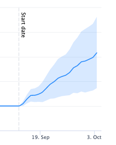
Source: SearchPilot
So what if I told you that you can create your own analysis and wow stakeholders with one of those graphs - for free?
Get ready, because in this article you will learn how to do it with Causal Impact, a data analytics package developed by Google that allows you to clearly display the effect of a change on a variable and also help you with business cases and decision making. And don’t worry, you don’t need to be a statistics or programming genius. Casual Impact on R is actually pretty accessible, and in this article you’ll find all you need to get started:
So let’s dive right in.
Causal Impact is a package for R that allows us to analyse a time series dataset and draw inferences about the causal effect of an intervention on a variable, as compared to the predicted outcome in the absence of a change. It also determines if the effect is statistically significant or not.
It’s based on a statistical model called Bayesian Structural Time Series (or BSTS for short), which uses prior information to predict the outcome of a variable in the absence of the treatment. This prediction is called the counterfactual.
It then compares the expected result (the counterfactual) with the actual outcome, and uses the difference to estimate the effect of the treatment.
Let’s see an example in practice:
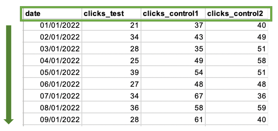
Let’s say that you’re running a simple title change test on your pages, like adding a price indication, with the hypothesis that it will improve clicks:

Once you apply the change, the data you’ll have at hand will most likely be from Google Search Console, Google Analytics or some other tracking tools, and while we can sometimes see a trend following our change on these platforms, it might be difficult to quantify exactly by how much our change affected the variable of interest (clicks, in this case)

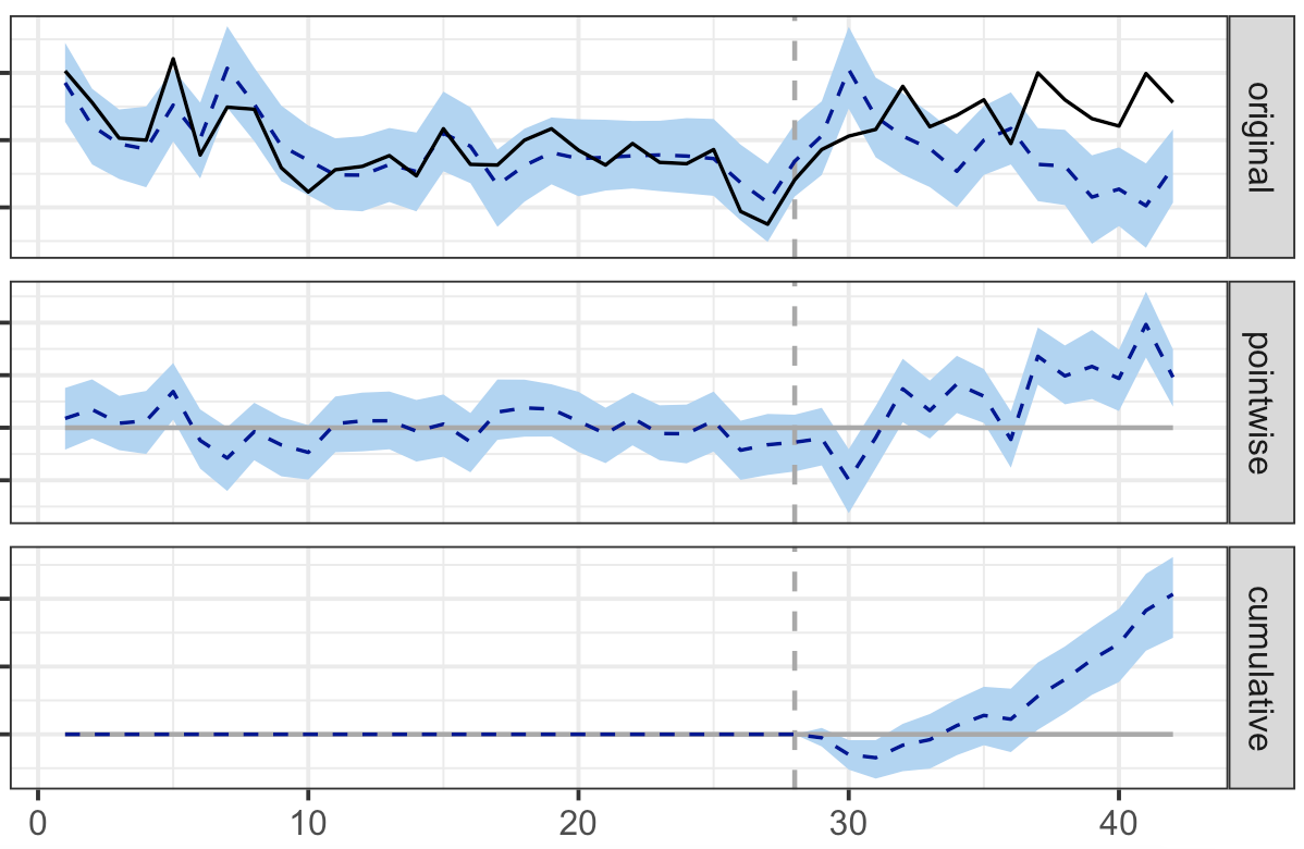
What Causal Impact does in practice is to help overcome this challenge, by taking our data, analysing the performance from the period before the change was implemented and the performance after, to give you a graph that will make it very easy to understand the impact of the treatment you applied to your test group:
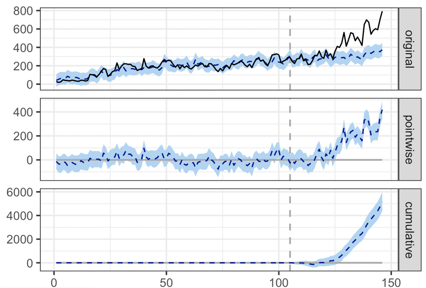
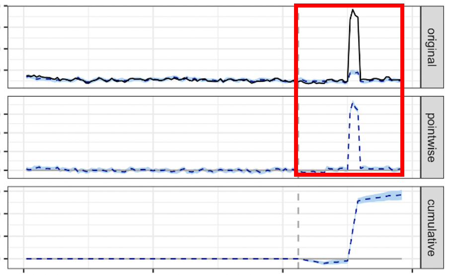
Example of a positive test analysed via Causal Impact
Here’s what each of the panels mean:
1) The first panel shows the original data along with the prediction in the absence of treatment:
a. The full black line is the actual outcome (the real clicks obtained).
b. The horizontal dotted line represents the counterfactual prediction for the post-treatment period based on the performance of the prior period. This is what the clicks would have been if no change was applied to the test pages, based on the number of clicks we had prior to the change and the control groups.
c. The vertical dotted line represents the launch date, so the time at which the treatment or the change was implemented. In this example, the date that the new title went live on the page.
d. The blue area around the lines is the fluctuation, the margin of error, as predicted by the model.
2) In the second panel we can see the difference between the observed data and the counterfactual prediction. This is the point wise causal effect, as estimated by the model. In our example, that’s the difference between actual and predicted clicks.
3) The third panel adds the point wise contributions from the second panel to calculate the cumulative effect of the change. This is your causal impact effect.
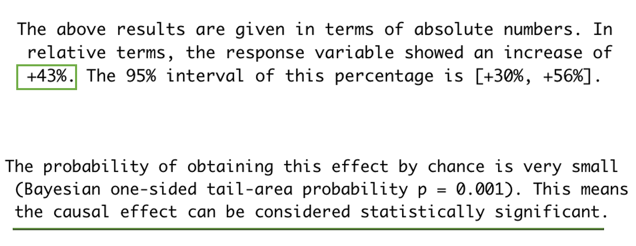
The graph is great for visuals, but the real value is given by the detailed summary we obtain in addition:
If the ease of reporting has not convinced you yet to give it a go, let’s see a few more reasons to try it out.
Quantifying an effect and understanding its statistical significance is beneficial for a number of reasons in our job, but in particular to streamline decision making for scaling up our changes with confidence.
Running tests is difficult enough as it is, after all. When I was just starting out talking about tests, I ran a poll on Twitter and LinkedIn, asking what my peers found to be the most challenging part of running one: 12% said choosing their test group was the hardest part, 38% said they had trouble analysing and trusting the test results, 25% said they struggled applying their findings at scale, and 25% said something else, which included ‘resources, costs and business buy-in’ – all things that Causal Impact can help with.
(Bear in mind: I didn’t have a huge number of followers at the time, so take those numbers with a grain of salt, but nevertheless, I think the results are indicative of the number of challenges we run into when running tests).
So there’s three main reasons why I suggest you give Causal Impact a shot:
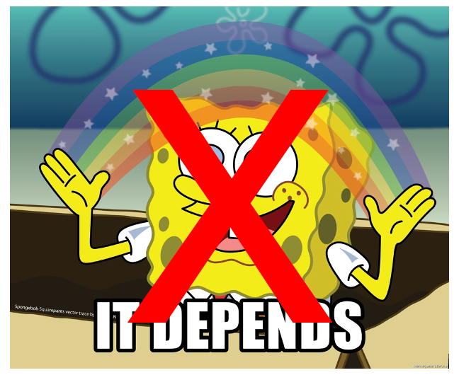
Whether you work inhouse or for an agency, your stakeholders will most likely ask for a forecast of the estimated upside before they spend money, time and resources on any initiatives, and as SEOs it can be tricky to provide clear answers.
However with Causal Impact, you can get rid of the blanket ‘it depends’ answer and provide a data-informed forecast with a degree of confidence based on the results you obtained, so that you can drive changes at scale.
You can use Causal Impact on a number of other datasets as long as they’re in a time series. For example, William Martin from UCL used it to estimate the effect of app changes on installs, and the hosts of the podcast DataSkeptic analysed the causal impact of Adele’s appearance at the Saturday Night Live on the visits to her Wikipedia page.
You can also try Causal Impact to measure the effect of influencer campaigns, and other types of initiatives without clear tracking to help you quantify results. (NB whilst you can Causal Impact on almost any time-series data, you might want to focus on upper funnel metrics like site views, sessions and users, since for deeper metrics, there are a number of layers that might influence performance that could be difficult to rule out.)
One of the biggest blockers for running tests is cost and resource. There are a few (great) tools around now that integrate Bayesian statistics to measure the impact on a split test and while they’re quicker to run, if budget is an issue, this is a great work around that allows you to get your testing under way.
Here are just a few of the scenarios where using Causal Impact can help us:
Hopefully I’ve now convinced you to try it yourself, so it’s time for a demo!
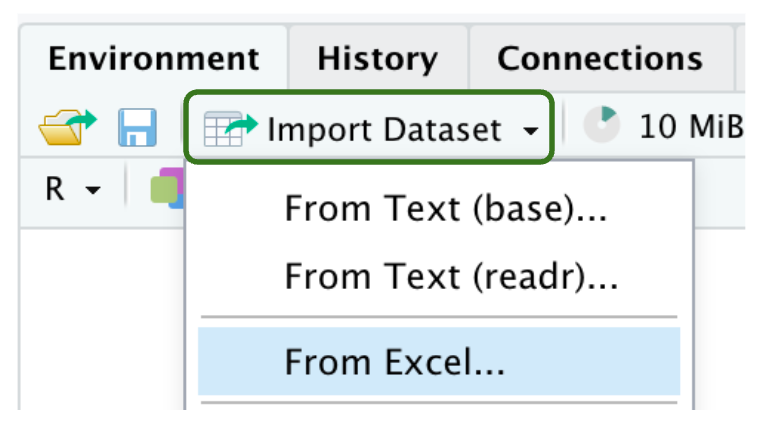
First, you’ll need to download R and then download RStudio. Both of them are free and open-source, and so you’ll find plenty of guidance online, and continuous improvements are made to the scripts by different contributors.
Once you’re done, open the software and you’ll see a screen that looks a bit like this:
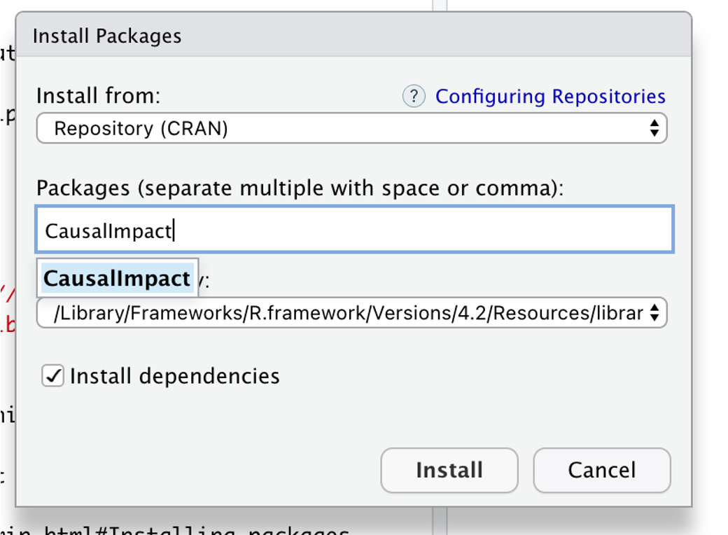
On the right-hand side there’s a packages tab. Go to ‘Install’ and search Causal Impact. Once you’ve installed that, all the libraries you need will be right there, so you’re ready to use the platform with your dataset of choice.
For simplicity, I’m using sample data from Google Search Console here, but you can use any of your usual sources to extract the data of interest. If you don’t have access to data of your own, you can also create synthetic data to practise (Marco Giordano has a guide on how to do it).
Because the model needs enough time to reliably estimate the counterfactual (the prediction of the performance in the absence of a change) based on previous performance, you’ll need at least twice the amount of data from your pre-launch period than your post-implementation period.
Let’s take the example of a title change test that you want to analyse after the two-week mark: you’ll need to export 6 weeks’ worth of data (4 weeks pre-launch and 2 weeks post-launch) to allow the script to run correctly.
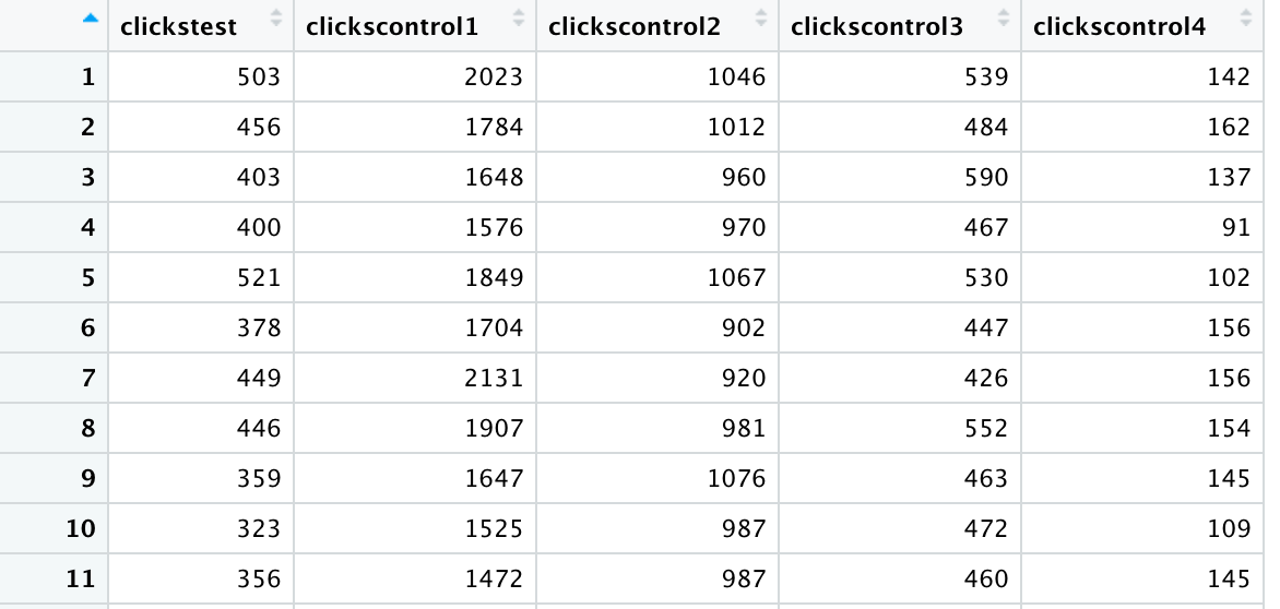
The download from GSC will look like this:
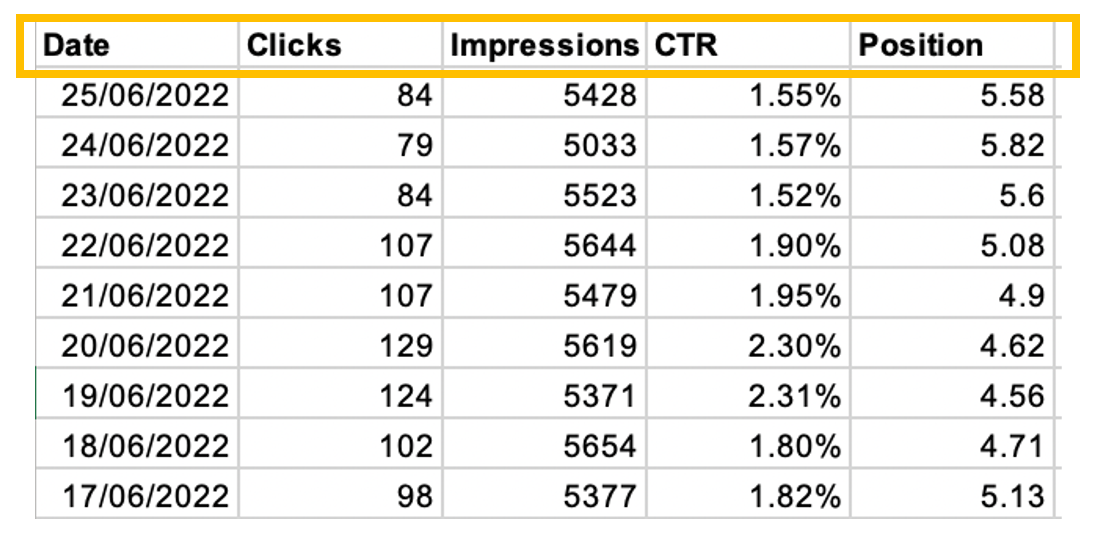
With the script I’m using, you’ll need to focus on one specific variable at a time. In this example, I’m looking at clicks, and since the GSC exports reports on additional metrics too, there’s a few things I need to do in order to get my dataset ready for analysis:
a) Sort the dates into ascending order, so that the most recent date is the one at the bottom.
b) Take away the columns that aren’t your metric of interest, in this case Impressions, CTRs and Average Position (so that you’re left only with the Date and Clicks columns)
c) Optional step: If you have another dataset that you can use as a control group, include the Clicks from that selection as the third column. You can add as many controls as you want, provided they’re a good fit (e.g. same pages in a different locale that didn’t get the treatment, general performance of the entire website and so on).
d) Check the data columns for 0 values: if there’s a zero, you will likely get an error message when trying to run the script. If you do end up finding a few, there’s two options you can choose from:
e) Rename the columns so that they don’t include special characters, which in my experience tend to break the script.
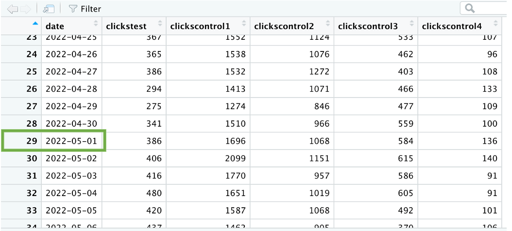
Your end result should look like this:
The hard part is over. Once you’ve saved this as an Excel file, you’ll be ready to run the script!
Import your Excel file and check the preview to make sure all your data looks correct.
Once the data is loaded onto the main environment, find your test launch date (e.g. May 1st) so you can map the rows corresponding to your pre and post periods.
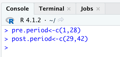
For simplicity, I’m going to use a sample that runs over 6 weeks (4 of pre-period, 2 of post-period) so you can follow along in the script. In my dataset, the launch date corresponds to row 29, so I know that my pre-period is from row 1-28 and my post-period is from row 29 until 42.
Note: For tests with changes with immediate impact (e.g. CRO, CRM, socials), it’s best to include the launch date in the post-period to fully appreciate the impact of the changes and avoid ‘losing’ a day, like we did in the example before. With SEO tests, you might want to leave the launch date as a standalone day and make the post-period start from the day after launch, when the crawler has had enough time to process the change. However, this can be misrepresentative for variables that show great variance in different days of the week, as the weeks post launch won’t overlap perfectly with the same days of the pre-launch. You can evaluate what the best fit is for your analysis based on the business model, the type of test, and changes you’ve made.
We’ll now move to the workspace in the bottom left of your R Studio environment, where we’re going to work through this script:
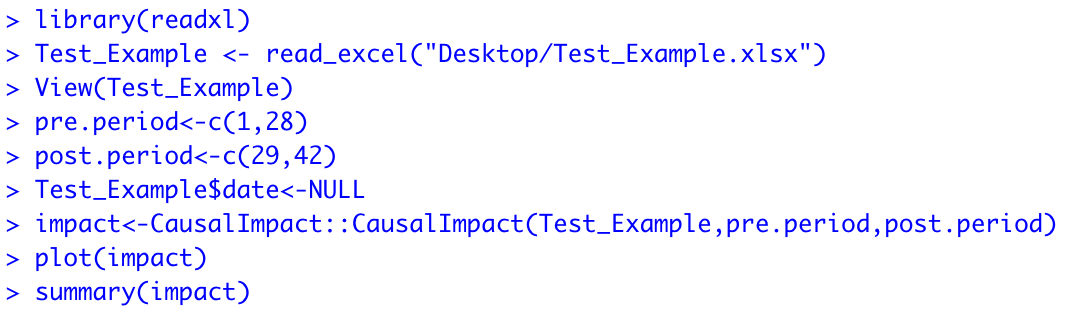
Start by typing out the first command to state where your pre and post periods start and end:
pre.period<-c(1,28)
post.period<-c(29,42)
At this point, you can remove the date column, since you don’t need it anymore to map your pre and post launch periods. This will bring your test group column to the front, ready to be analysed and compared to the controls.
Test_Example$date<-NULL
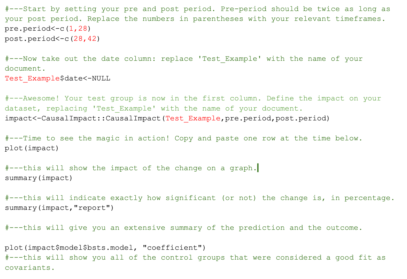
And now, it’s time to plot the impact and watch the magic happen!
impact<-CausalImpact::CausalImpact(Test_Example,pre.period,post.period)
plot(impact)
Now that you have that pretty graph I promised you, the next command comes in handy to actually understand what it means, by quantifying the impact and the confidence level of the statistical inference.
summary(impact)
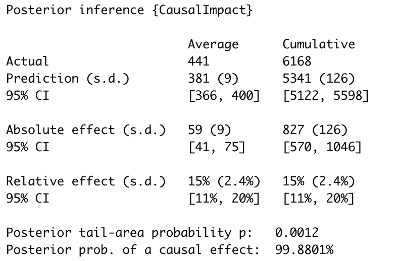
And for a written summary of the values above that you can use in your reports, you can input the line below:
summary(impact,"report")

Finally, if you included one or more control groups in your analysis, you can use this command to understand the probability of them being used by the model, and how much of a good fit they were for it.
plot(impact$model$bsts.model, "coefficient")
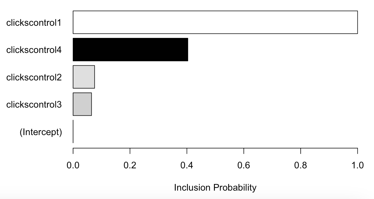
The closer the bar is to 1, the higher the chance that the control was used by the model as a predictor. A control closer to 0, is less informative for the model.
The colour indicates the direction of the coefficient:
While control groups are not mandatory to complete your analysis, I find them useful to strengthen the case for the impact your change makes (especially in those cases when the coefficient is closer to 1 and is negative, showing that the impact is more likely due to the treatment rather than the general trend of the website).
And that’s your first analysis done! Here’s a summary of all the commands we’ve seen (the fields in red will have to be replaced with your own data):
Bear in mind that whilst this script is a good place to start, you can find versions of Causal Impact scripts all over the web, so once you get comfortable with this one you can explore all of the other things that RStudio has to offer.
A few things I learnt from running this script over and over:
Now that you learnt how to use Causal Impact, I need to warn you about one thing: statistics are not infallible. This quote summarises the dangers of using statistics recklessly to interpret real-world data:
“Statistics can be made to prove anything – even the truth.” - Noel Moynihan
With marketing tests, we’re not working in a sterile lab environment, where most variables are controlled – we’re working with real world data, and in the digital landscape a lot can (and will!) impact your data, so there’s a few things you need to be mindful of:
My suggestion is to keep a working document with the rest of your team where you can map all of the known internal changes (dates of your tests, dates of other initiatives and engineering releases) as well as the external events that might affect your data. This will allow you to take into account any known factor during the timeframe of your test and isolate at your best the effect of your treatment on the variable you want to analyse.
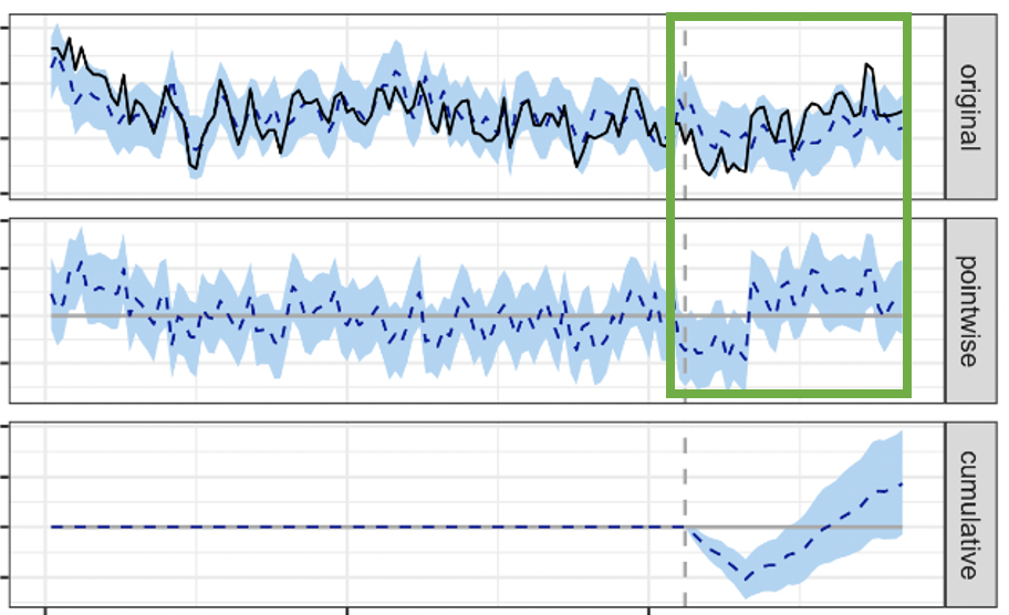
Outliers can massively affect your data. Take this example:
This, in theory, is a great positive result. However, you can see very clearly from the first panel that there’s something not quite right with the data, and that this spike is likely caused by one or more outliers.
Outliers can originate from a number of instances, but most commonly:
And here’s a few things you can do to minimise the occurrence of them:
Example of the previous test once outlier values were removed from the dataset: it’s inconclusive.
We’ve all been there: you came up with the idea for the test, you feel strongly about your hypothesis and the change you’re implementing – therefore you really want the test to work out and prove your point. But what if it doesn’t? What if it’s an inconclusive – or worse – a loser?
Don’t despair. We can still learn from tests that don’t work out (I think that’s what my horoscope says every other day, at least). You have a couple of options in this case: you can let the test run a little longer, or repeat the test with bigger groups. Both of which allow for more data to be gathered to see an effect.
However, if after these tweaks the test is still inconclusive or negative, then you’ll just have to take your losses (and your learnings), revert the change and focus your efforts on other tests instead. That’s the reason they call them ‘test & learns’, after all.

And that’s about it!
I hope you find Causal Impact as useful as I have. Will it work for you? I’d say it depends, but I really don’t think it does.
Here’s some more useful resources you might like to check out:
• How we use causal impact analysis to validate campaign success - Part and Sum
• Measuring No-ID Campaigns with Causal Impact - Remerge & Alicia Horsch
• Causal Impact – Data Skeptic
We pay our authors, speakers & team to bring you helpful content like this.
We aim to always keep our content and community free and accessible.
If you've found value in WTS, please consider supporting us through our Buy Me a Coffee initiative.

